Dobell Menswear

Skills:

Brand Strategy & Research
Tone of Voice Development
Competitive Positioning
Visual Identity
Creative Direction
Brand Guidelines

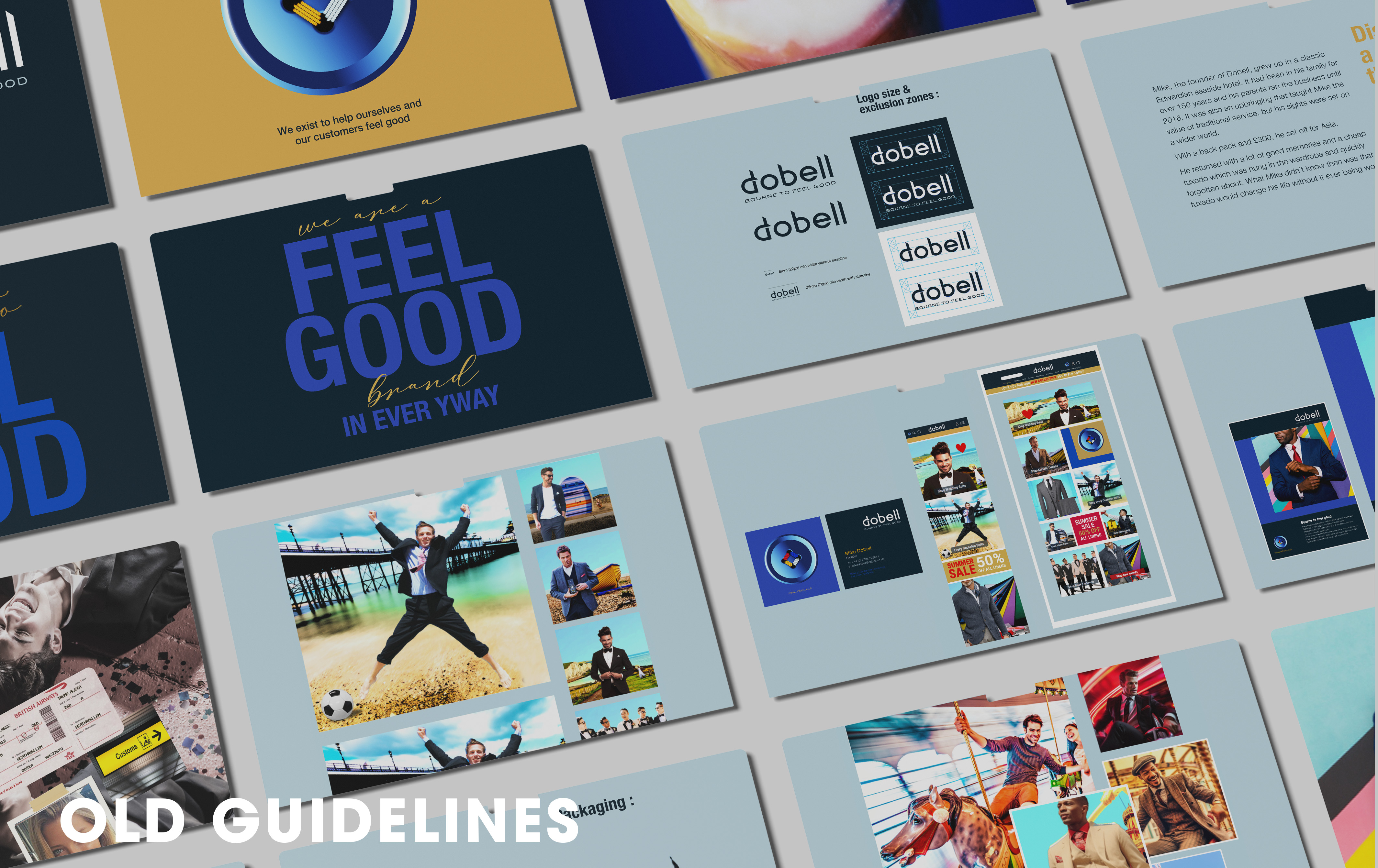
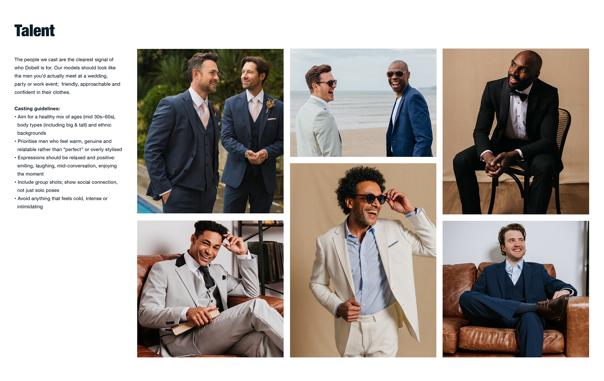
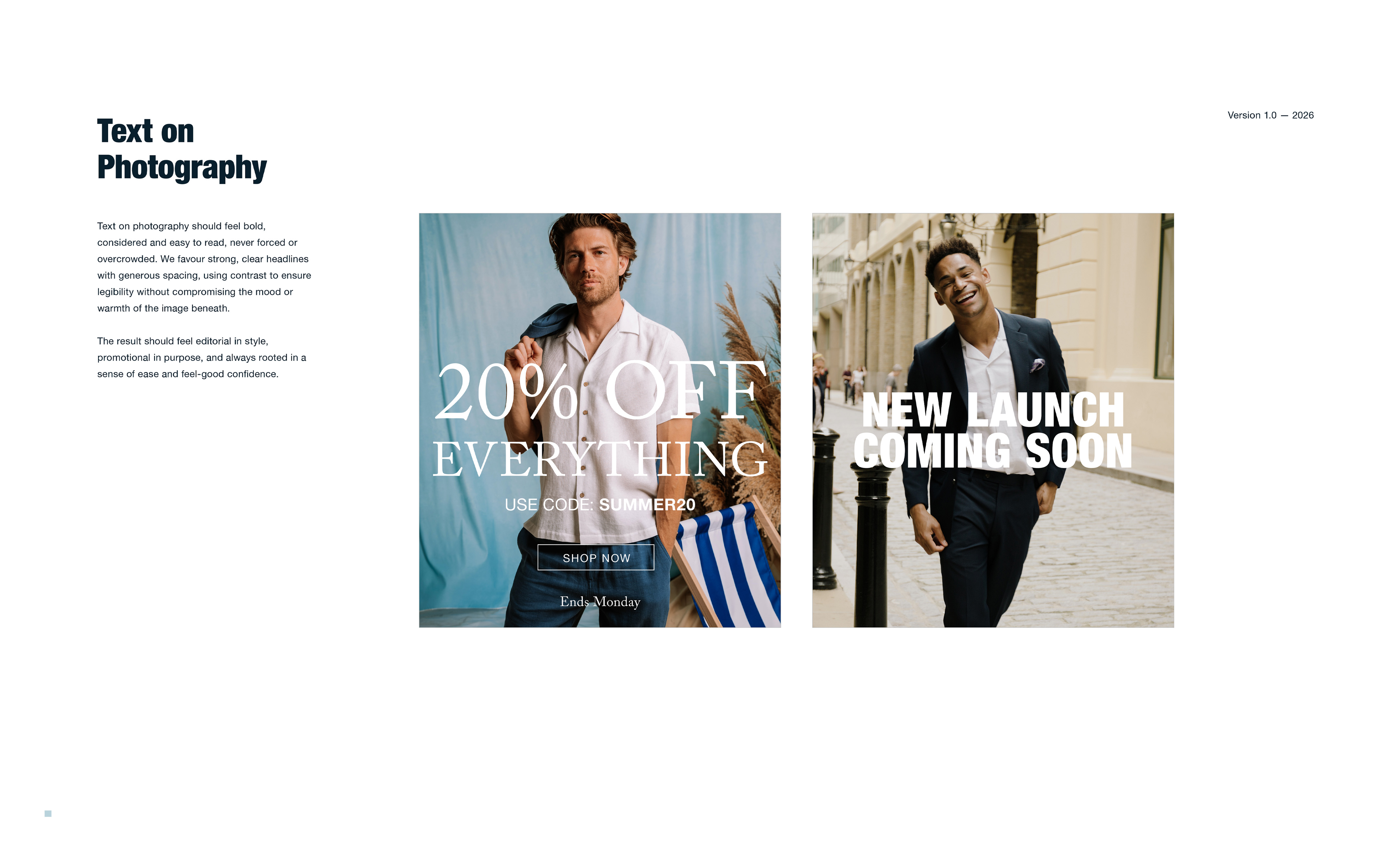
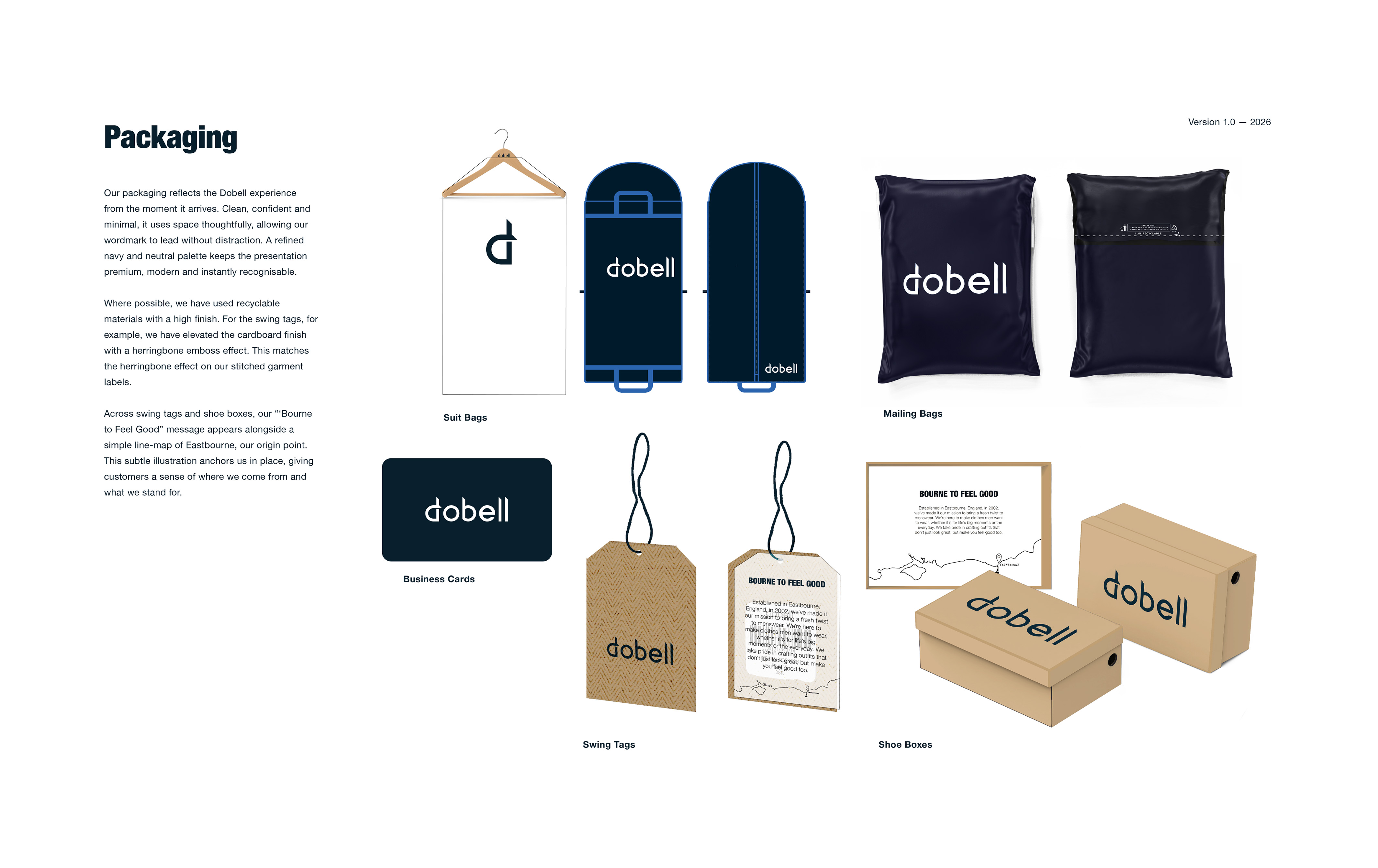
I inherited brand guidelines that felt loud, gimmicky, and out of step with who Dobell's customers are. The brand needed to embody its strapline; Bourne to Feel Good - Dobell's promise of effortless confidence for real men and the exisiting guidelines did not reflect this.

Leadership had already acknowledged that competing against ultra-low-cost platforms like Temu and Shein was no longer sustainable. Future growth would come from brand trust, not gimmicks. As Brand Lead, my role was to make that shift tangible.

I began with conducting a comprehensive brand discovery project combining a 240-response customer survey, staff questionnaires, GA4 analytics, Trustpilot reviews, and Meta targeting data. Using frameworks like Benefits Ladder and Golden Circle, I then developed customer personas and a competitive positioning map that informed every creative decision that followed.

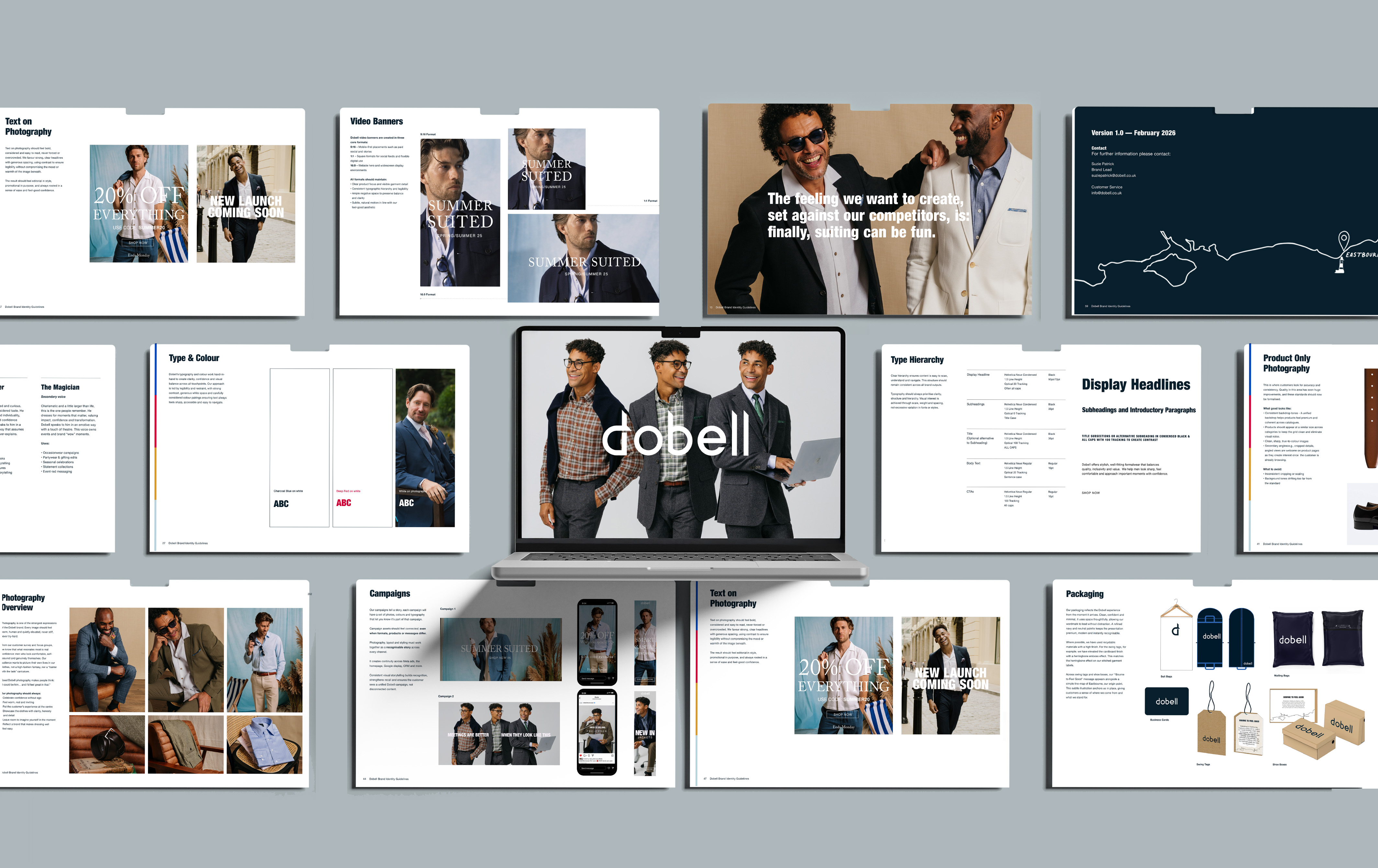
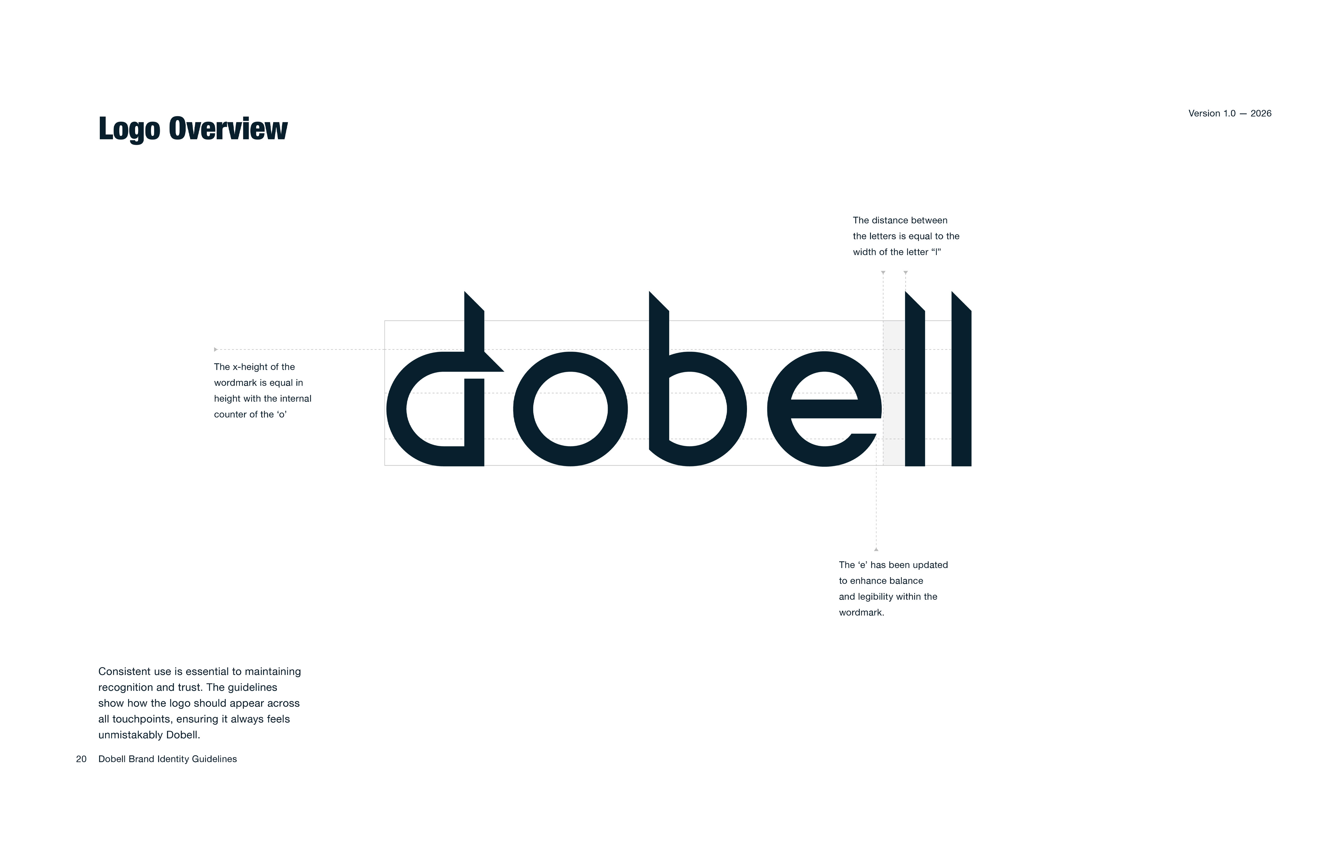
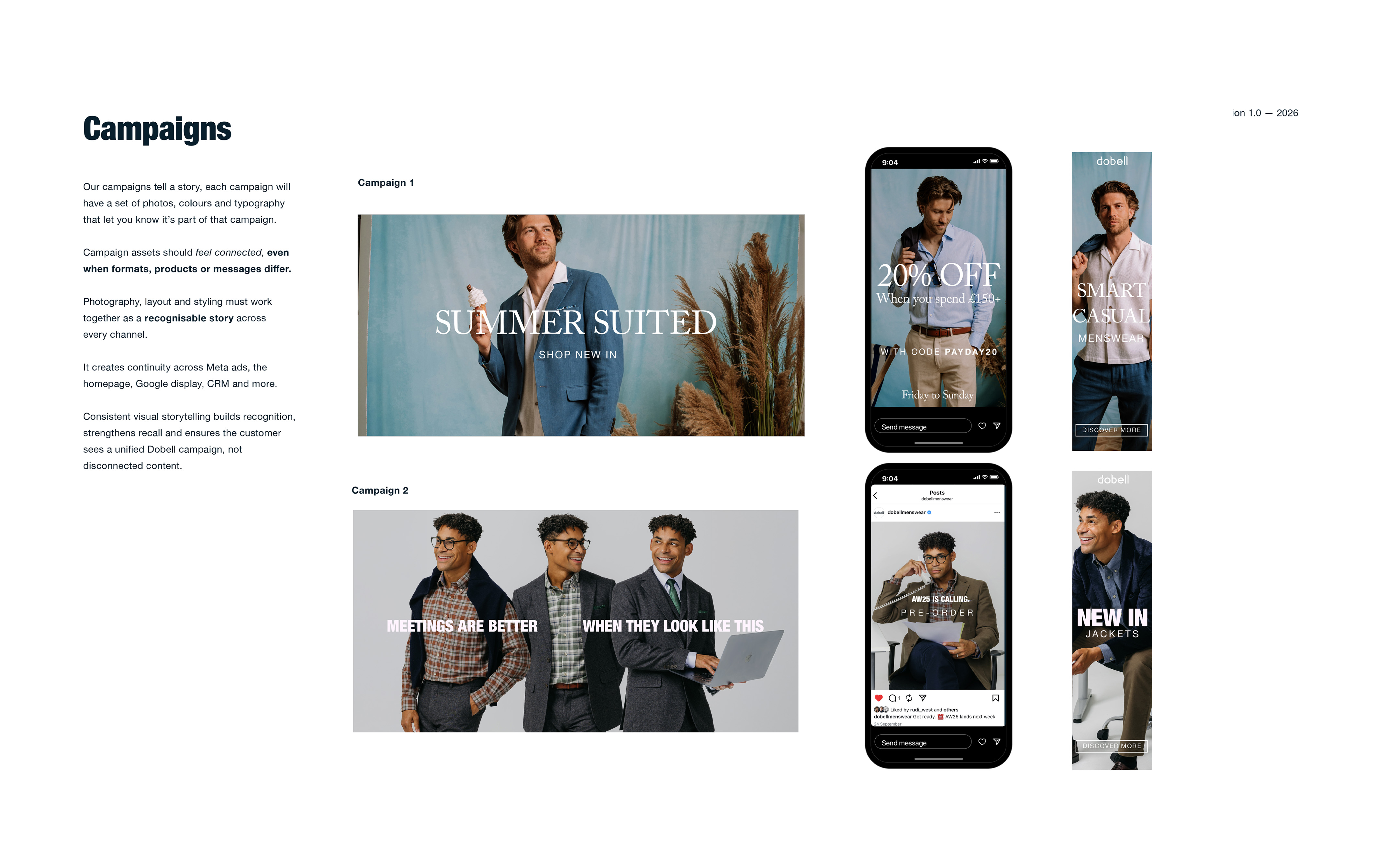
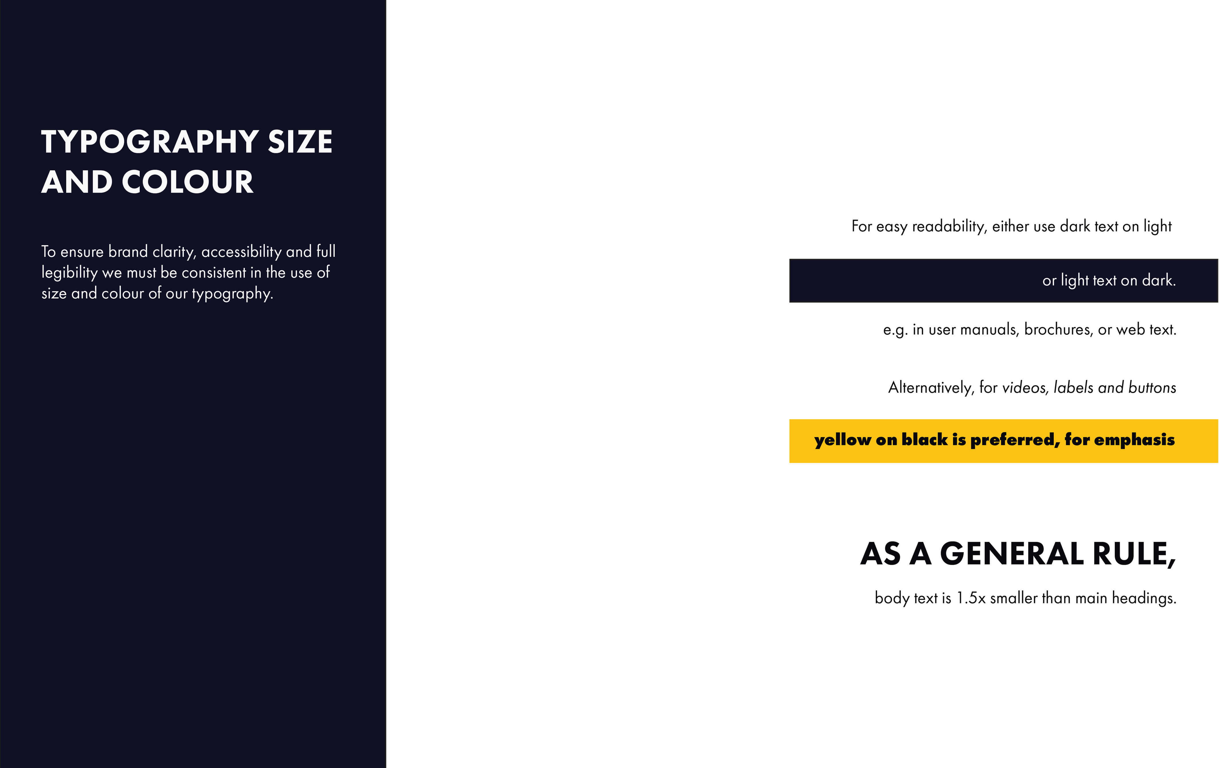
The result was a comprehensive set of brand guidelines  covering visual identity, tone of voice, photography, colour, typography, and digital application. These were built from scratch and delivered as Dobell's first ever formal brand document, guiding the brand away from "stack it high, sell it cheap" execution toward a calmer, more confident expression of Bourne to Feel Good.

Challenge:
Refresh Dobell’s brand identity and tone to match what real customers value, replacing a loud, gimmicky guideline set with something respectful, clear, and confidence‑building.
Approach:
  • Analyzed customer survey responses, focus groups, and desk research to surface a unified customer truth
  • Reframed brand promise to: “Effortless confidence for real men” defined via Golden Circle and Benefits Ladder frameworks.
  • Set practical creative rules driven by research, not personal taste
  • Stronger alignment with customer expectations, supporting better creative performance
  • Connected identity, tone, and art direction to real use cases across web, email, and campaigns
Impact:
  • First Black Friday under the new brand direction delivered £26k over budget — UK comms and site execution singled out by leadership
  • Meta ROAS improved 150% year-on-year (5.38 → 13.43), with top campaigns hitting 17.6x against a 2–4x industry benchmark
  • Email open rates held at 20–34% throughout the period the brand-led approach was in place
  • Inclusive visual messaging  representing all body types across every channel was felt by customers. For plus-size men, who are rarely represented in menswear, this mattered: "I automatically felt good, felt like me, and felt like I was ready to get married. First time I've used Dobell but not the last" - A customer who found Dobell nine days before his wedding after a difficult experience elsewhere
Date:
2024-26

Airbox

Skills:

Visual Identity
Strapline
Logo Design
Photography Direction
Brand Guidelines
Print & Digital Application

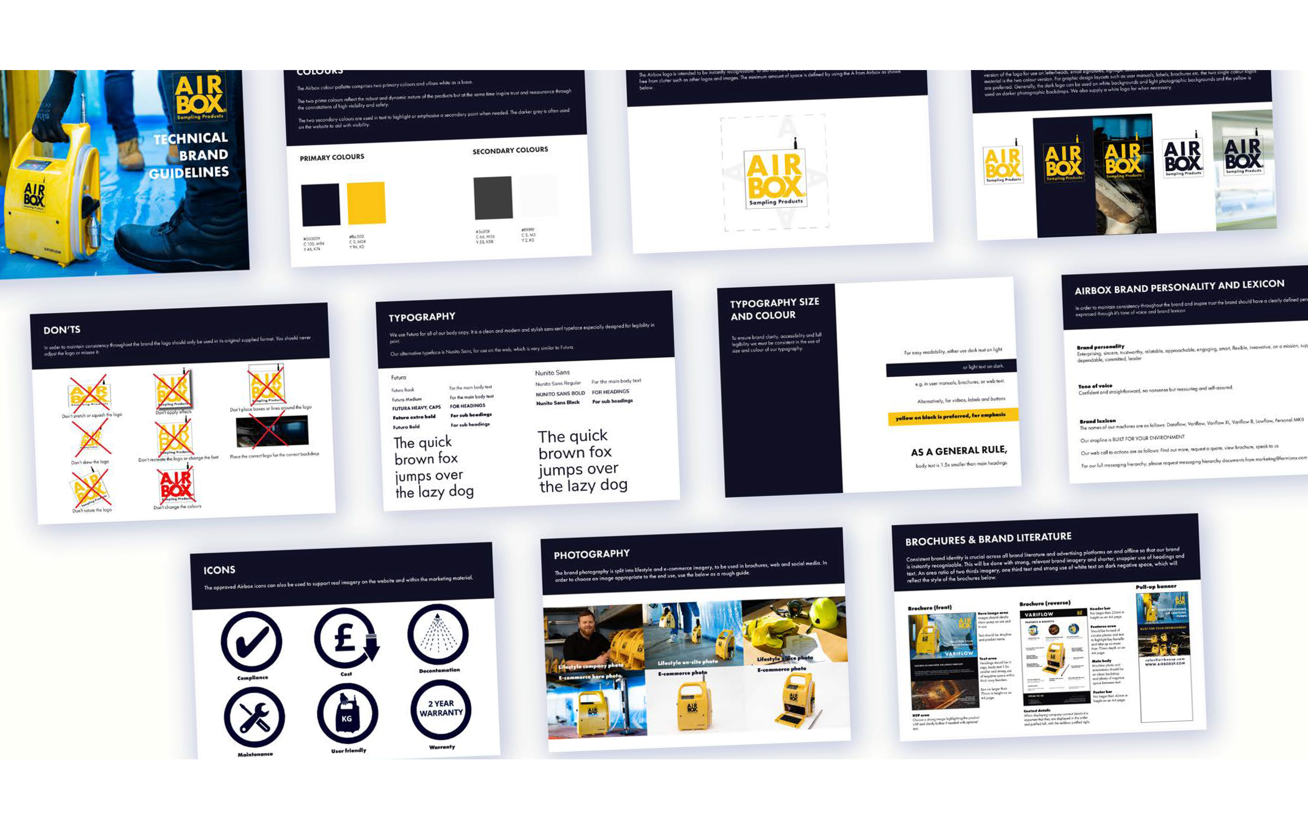
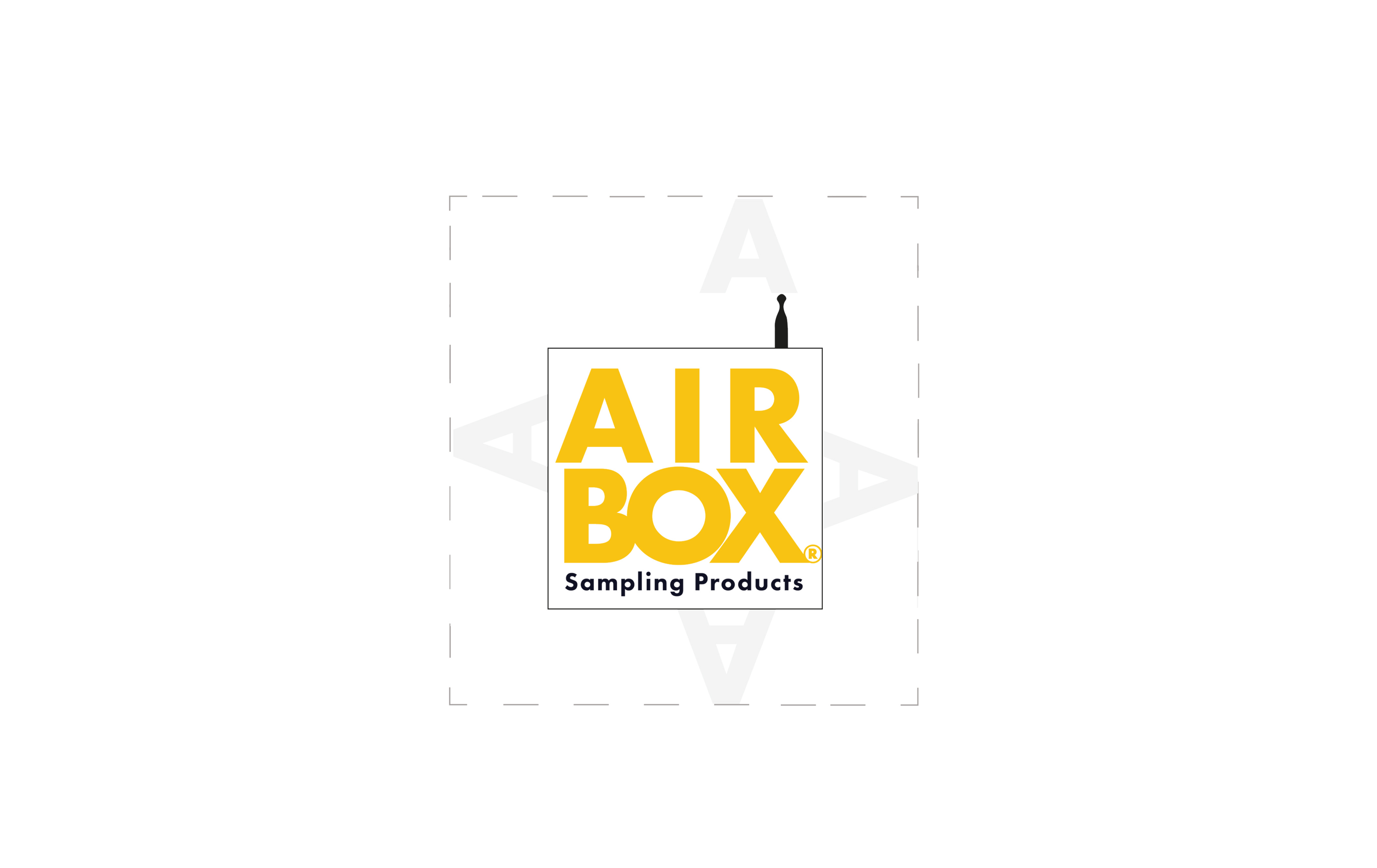
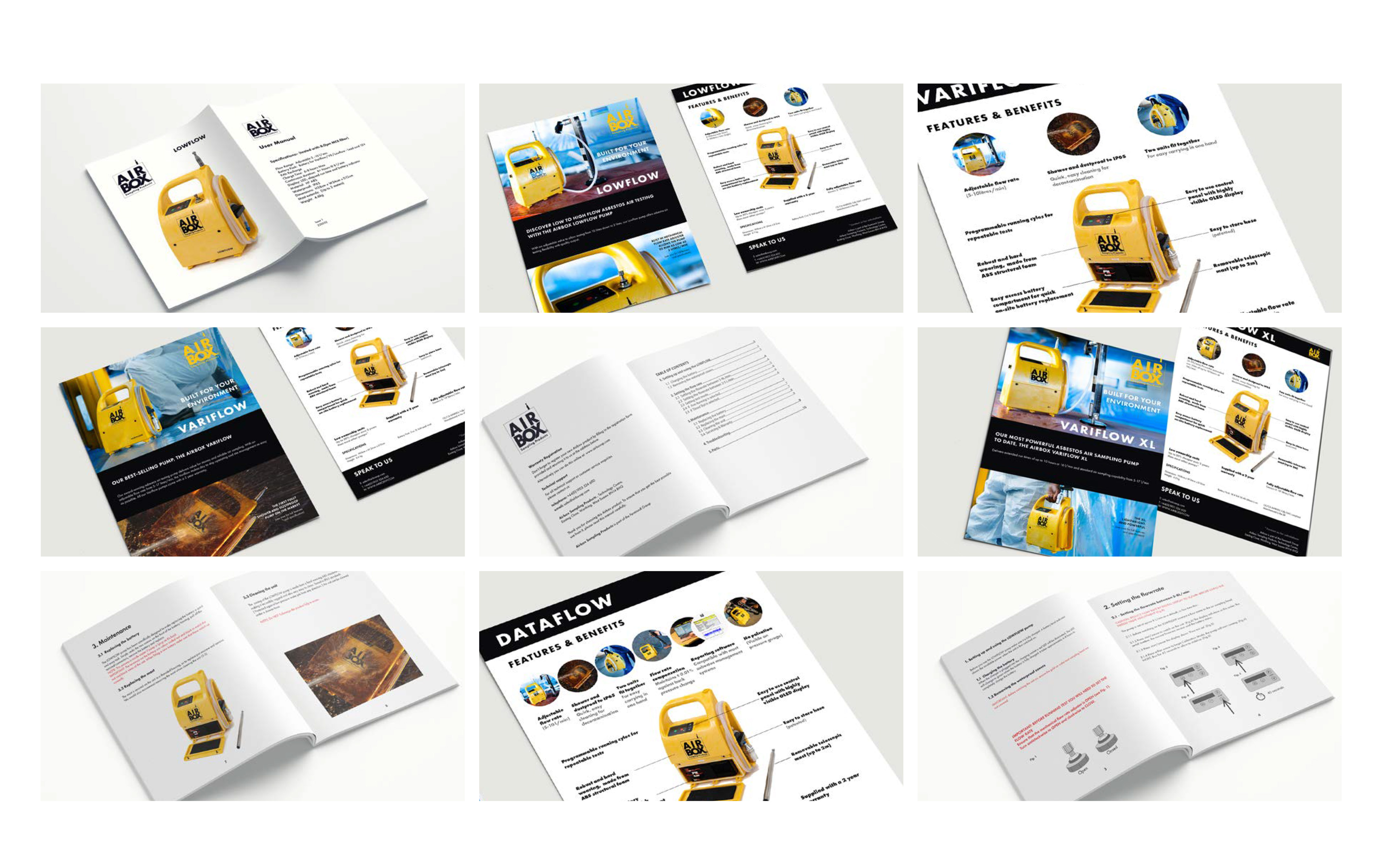
Airbox had a strong product but a brand that didn't reflect it. Through stakeholder interviews, customer conversations, and close work with the Sales Director, I developed a new identity and strapline (Built For Your Environment) that repositioned Airbox as confident, professional, and built for the environments its customers actually work in, applied end-to-end across digital and print.

Challenge:
Modernise and formalise Airbox's brand identity to reflect the professionalism of its customers and the quality of its products, creating a cohesive system that could be applied consistently across digital and print.
Approach:
  • Conducted stakeholder interviews and collaborated closely with the Sales Director to surface brand truths and business priorities
  • Spoke directly with customers to understand how professionals in the field relate to their equipment
  • Designed a full visual identity: logo, colour palette, typography, grounded in trust, visibility, and durability
  • Set clear photography direction across lifestyle and ecommerce contexts
Date:
2026

Atlas Anti-Rust

Skills:

Logo Design
Visual Identity
Typography
Colour System
Print Application
Digital Application
Brand Guidelines

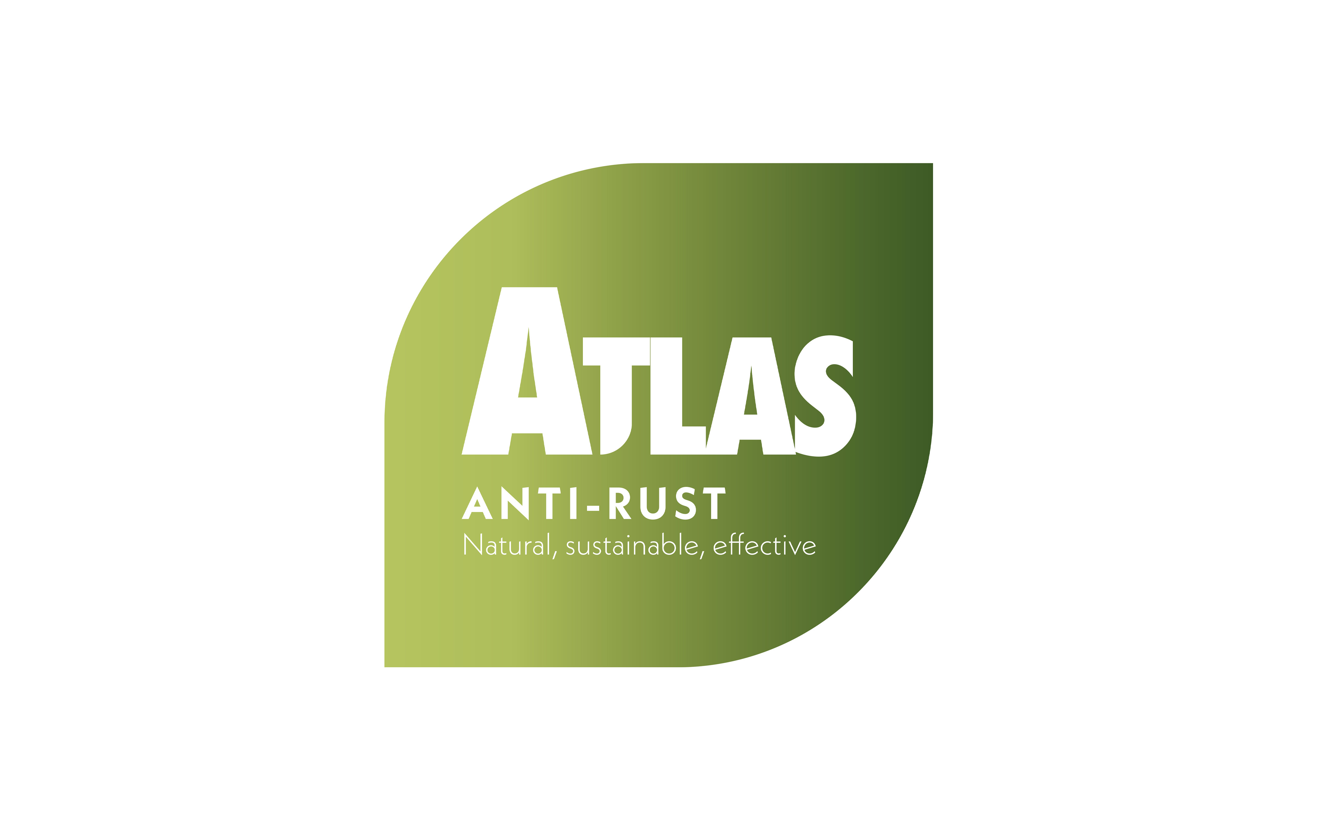
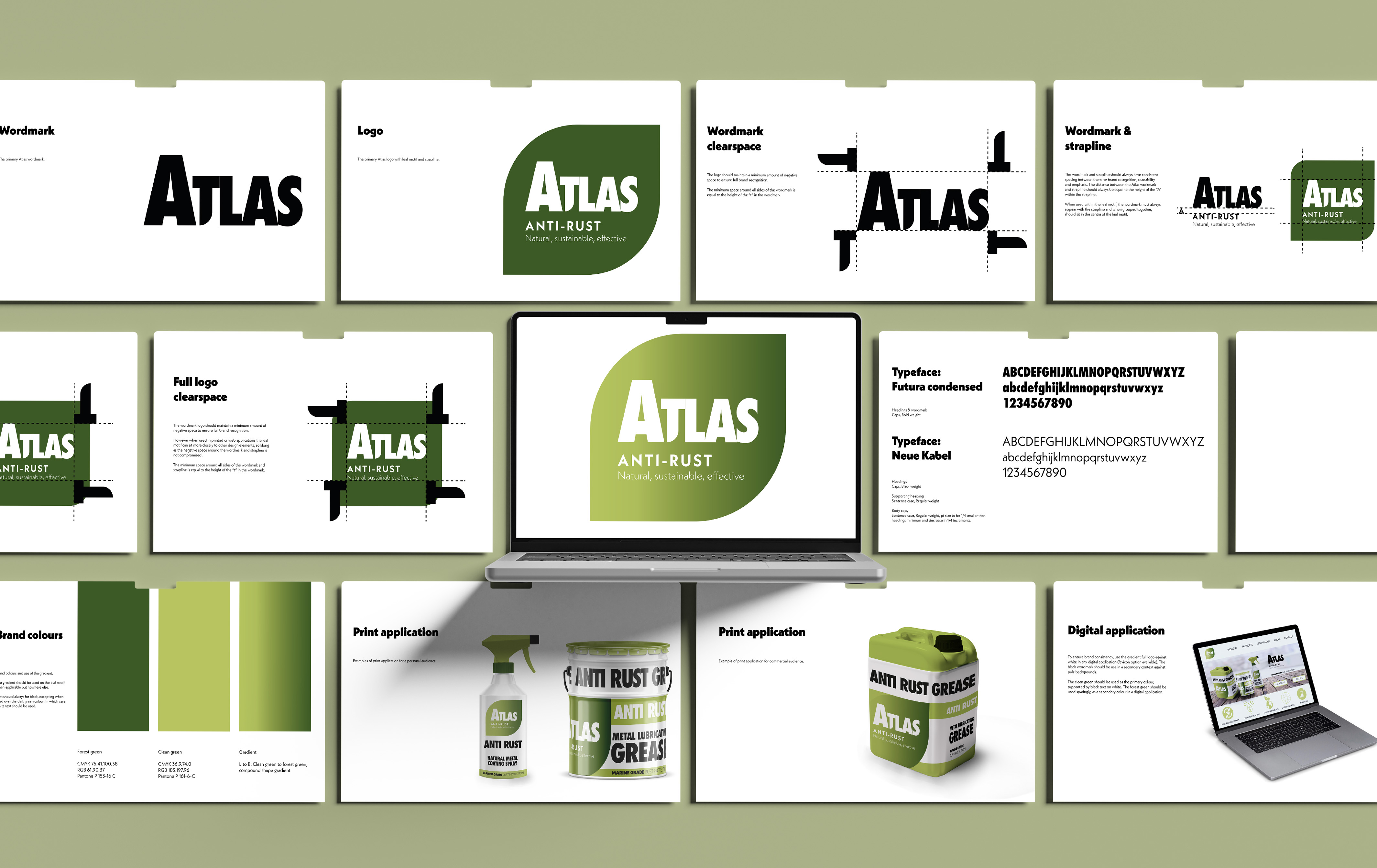
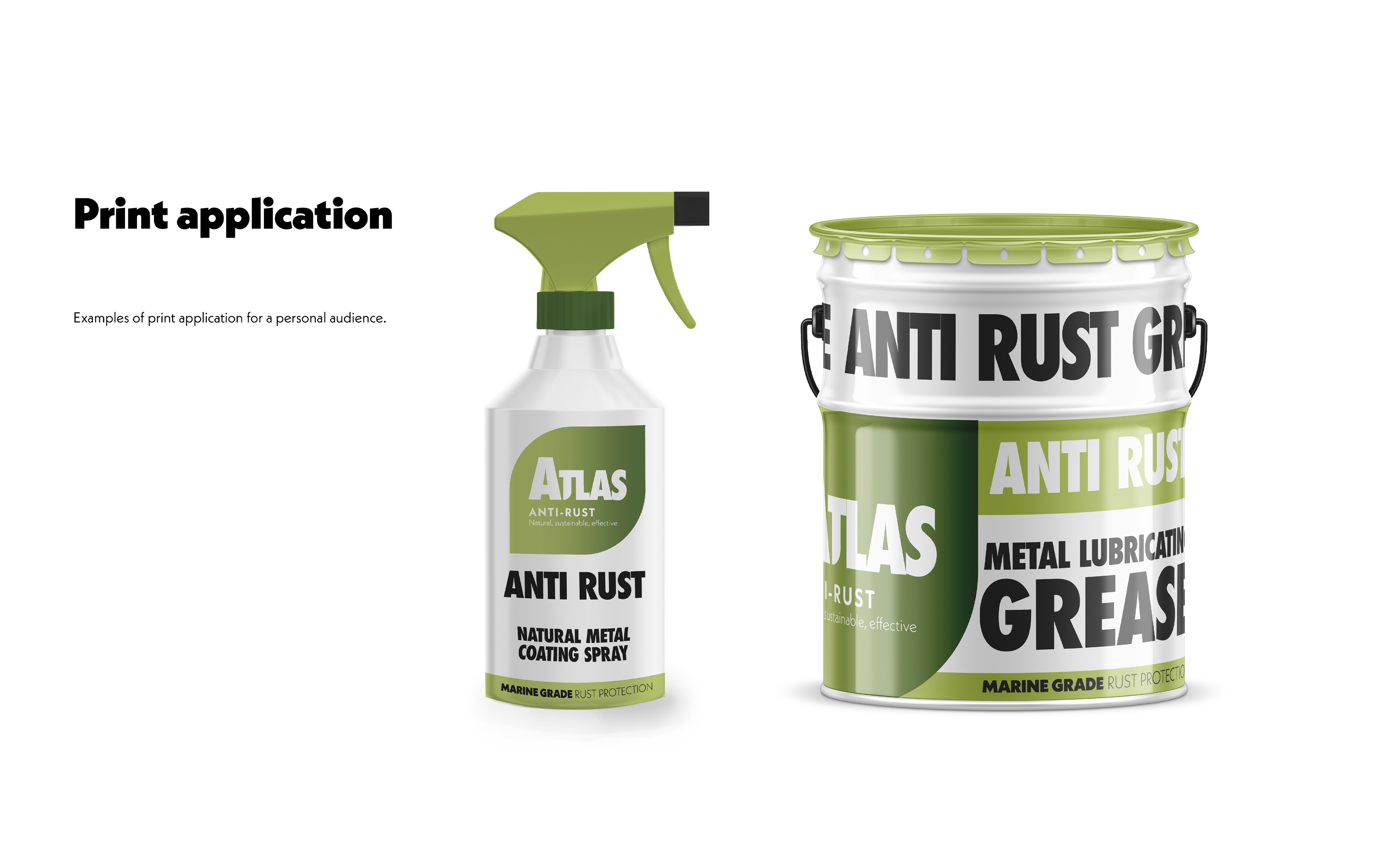
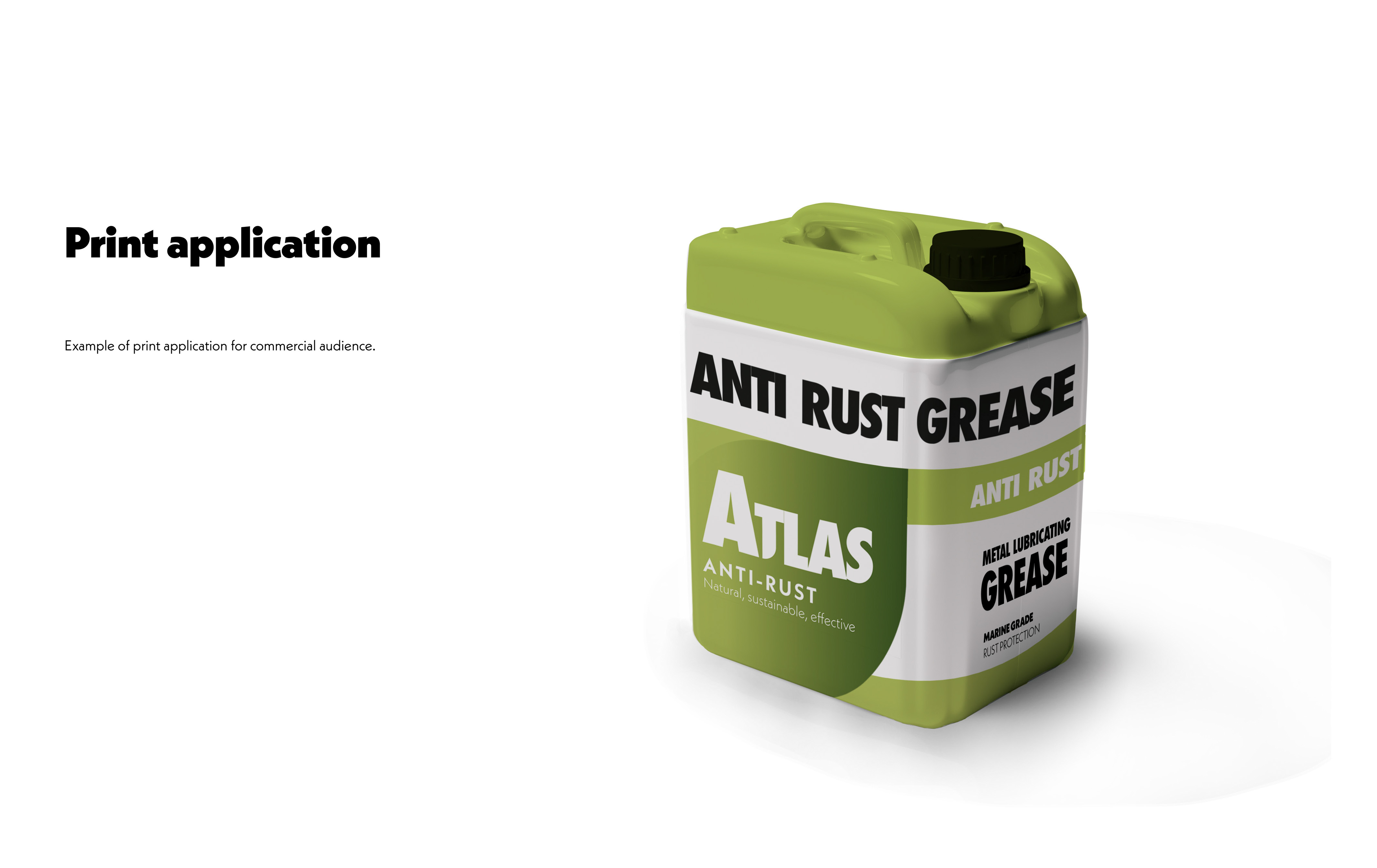
A speculative brief for an eco-friendly anti-rust treatment targeting both personal and commercial audiences. I developed a full brand identity from scratch: logo, colour palette & typography, balancing the natural, sustainable credentials of the product with the no-nonsense clarity its professional audience expects.

FermionX Group

Skills:

Brand Architecture
Brand Strategy
Visual Identity

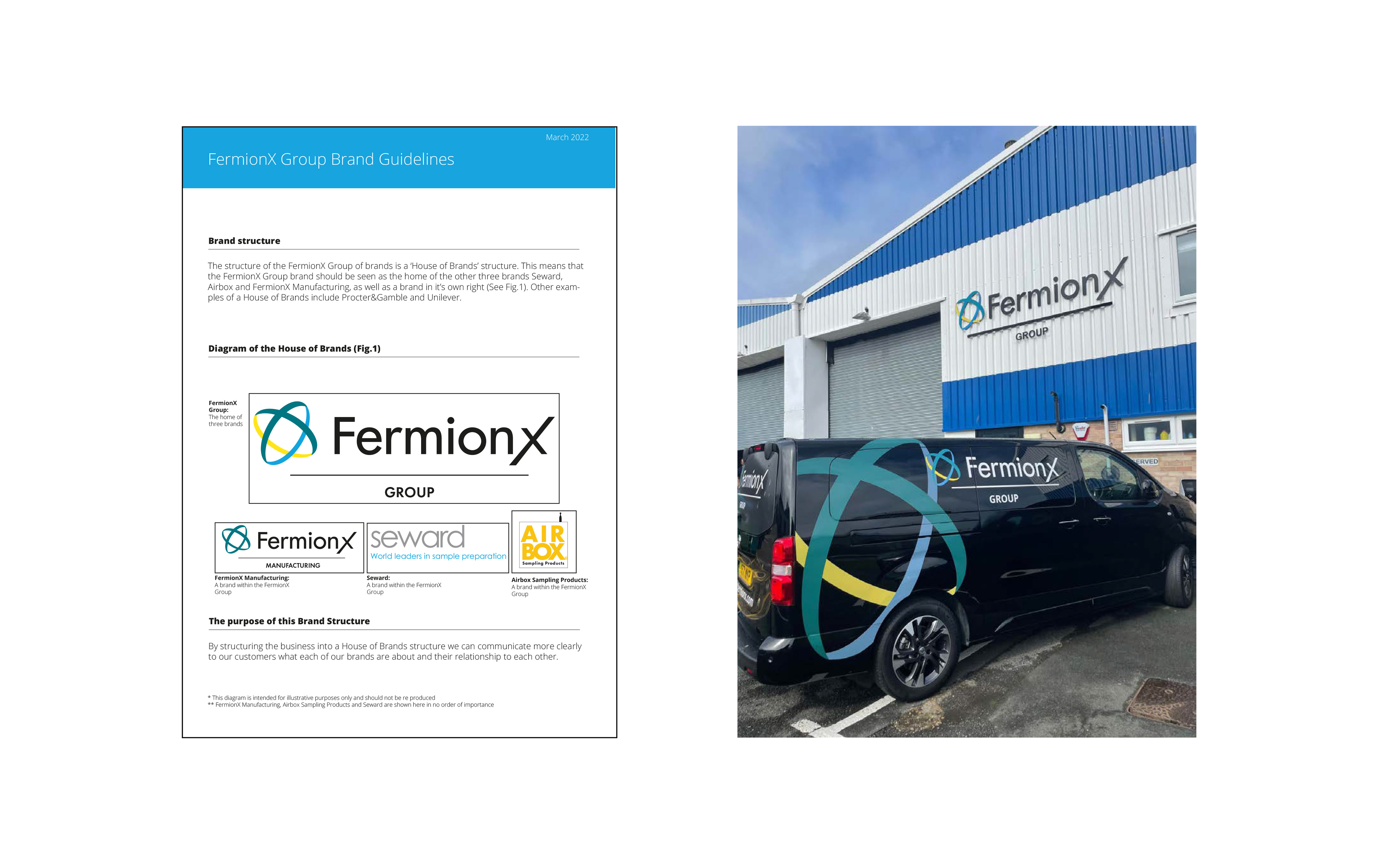
FermionX, Airbox, and Seward operated as separate entities with no clear relationship between them; confusing for customers and inconsistent in the market. I developed a House of Brands architecture, creating FermionX Group as the parent identity to sit above the three sub-brands, clarifying how they related to one another without erasing their individual identities.

Challenge:
Three related brands, FermionX Ltd, Airbox Sampling Products, and Seward Ltd, were operating without a clear structure to communicate their relationship, creating confusion for customers.
Approach:
  • Identified brand architecture as the strategic solution to clarify the group structure
  • Applied a House of Brands model, creating FermionX Group as the parent identity
  • Renamed FermionX Ltd to FermionX Manufacturing to reflect its role within the group
Date:
2023

The Worthing Gardener

Skills:

Product Design
Brand Systems.
Branding.
Figma.

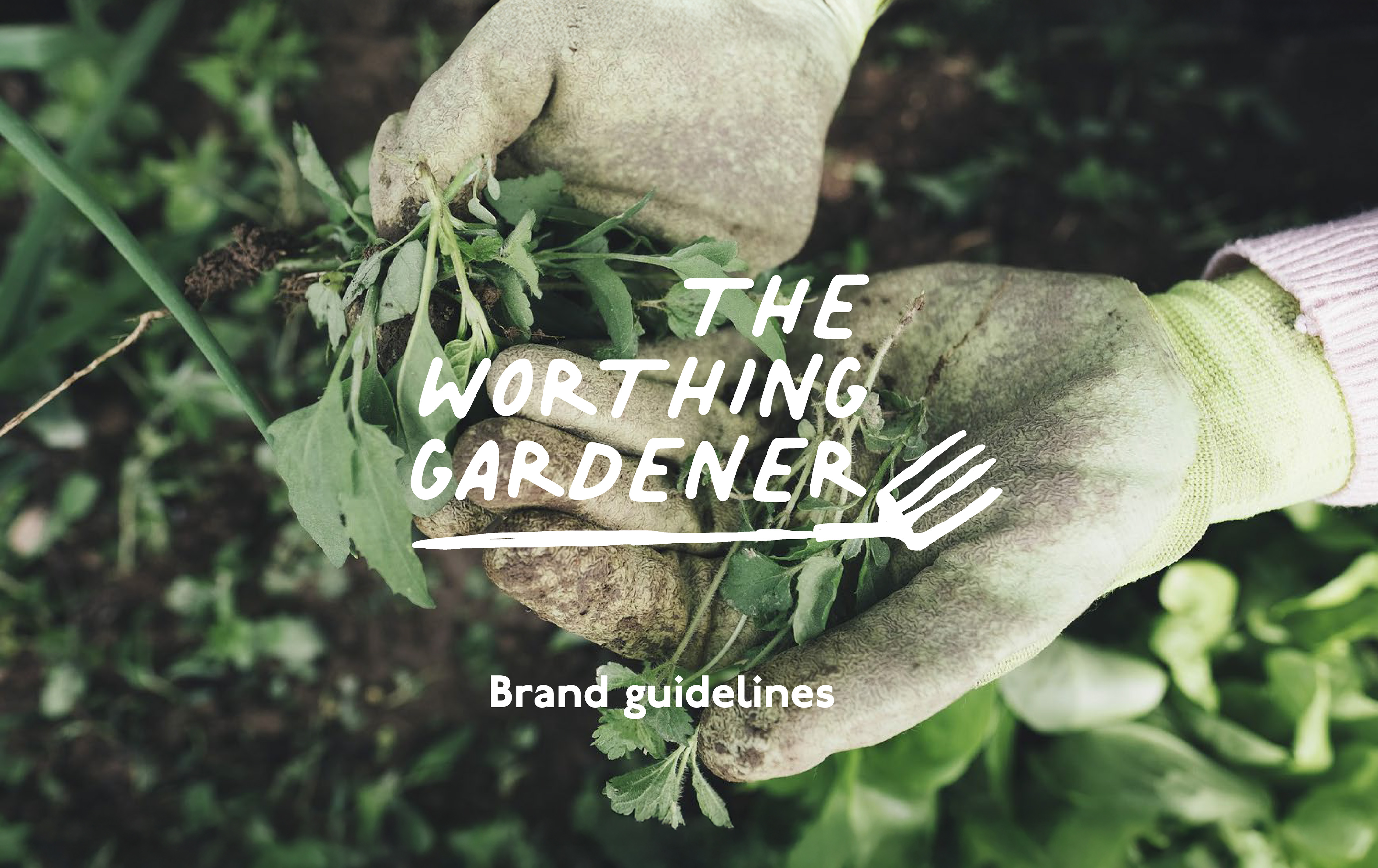
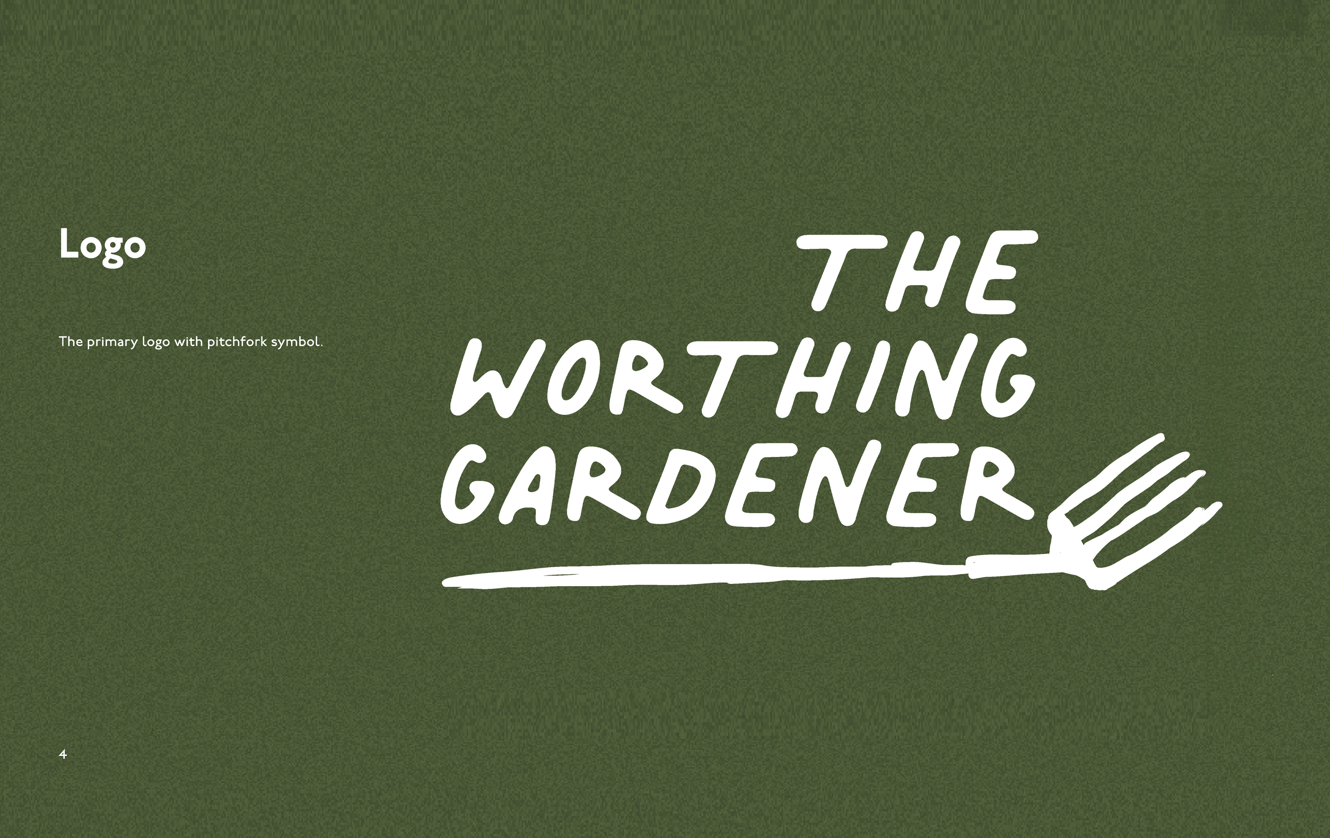
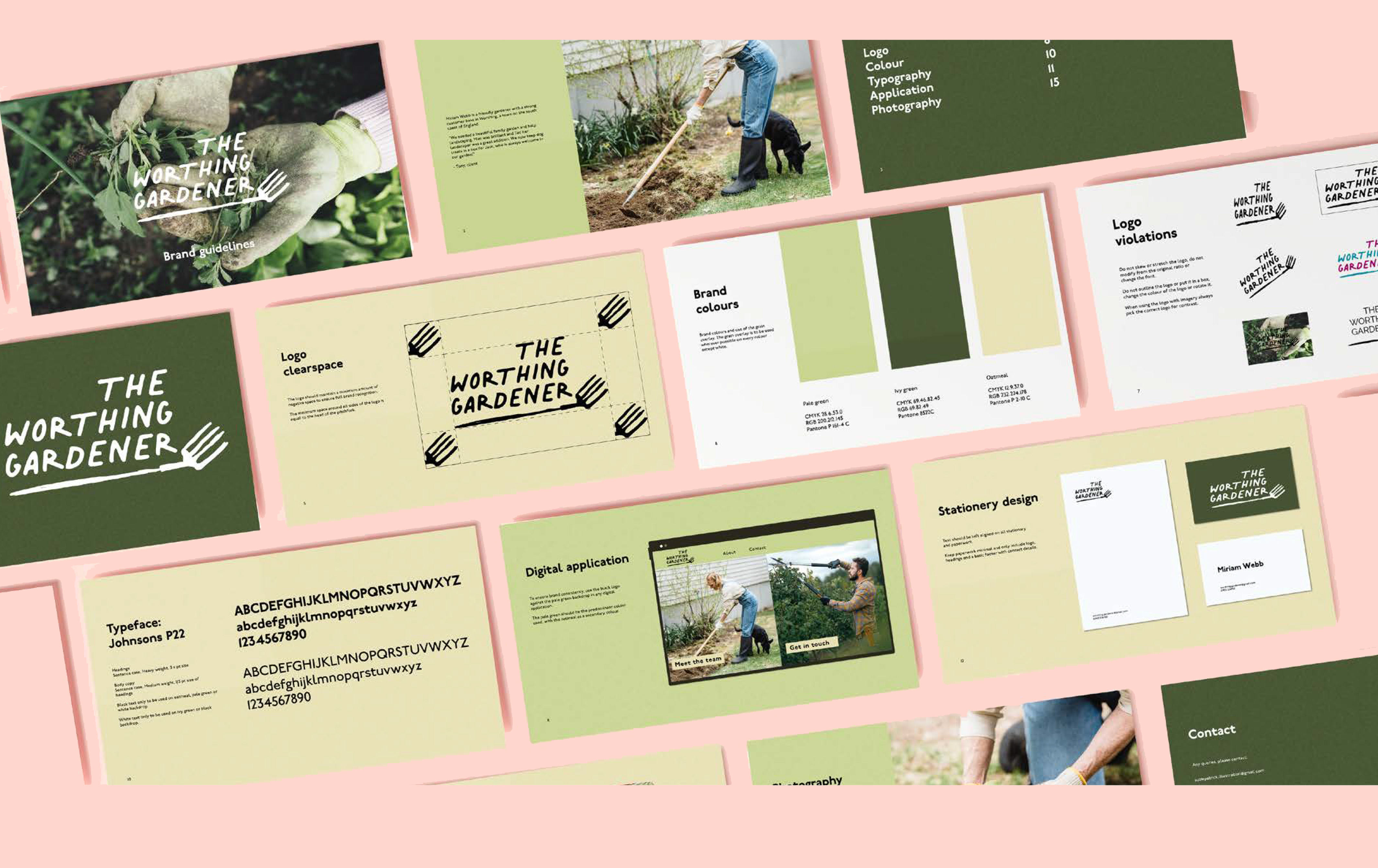
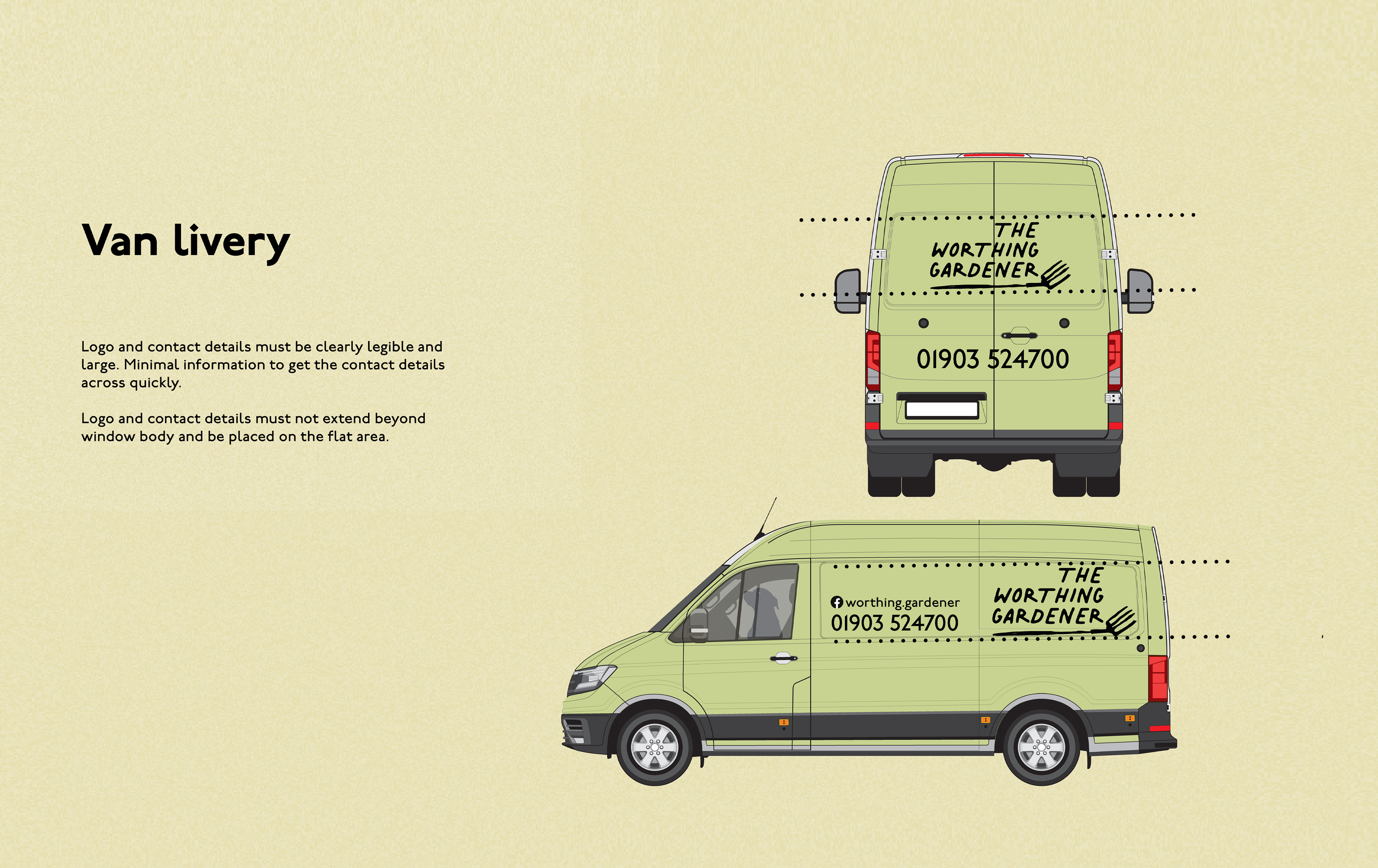
A fictional branding project for a local sole trader gardener including hand-drawn logo, earthy colour palette, and full guidelines from van livery to digital application. Full brand guidelines available on request.

Challenge:
Create a visual identity that would appeal to a younger audience moving into the area, without alienating an established and loyal existing customer base.
Approach:
  • Developed a hand-drawn logo with pitchfork motif to feel characterful and approachable rather than corporate
  • Created comprehensive brand guidelines covering typography, colour, photography direction, print application, digital application, stationery, flyers, and van livery
Date:
2023